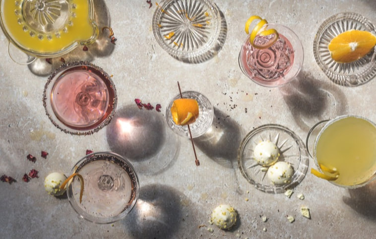
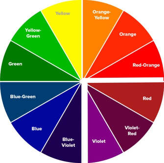
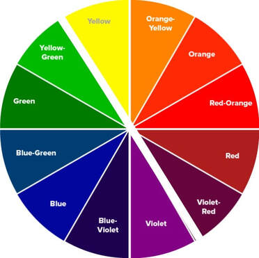
 COLOUR TEMPERATURE The colour wheel is a great tool when you are planning the scene you want to photograph. I use it all the time to help me choose colours to create my food story. For instance, the wheel has a cool and warm side. Where on this does your main subject sit? Is it a basket of oranges, vibrant and lively, or perhaps a leafy salad, cool and restful. Once you have your starting point, you can begin to bring in other colours to create the mood you are looking for.
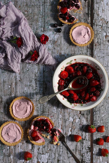
 Here's another analogous image. Can you see the colour scheme here is green/yellow/orange? The scene is harmonious and restful. I have used a soft edit here. 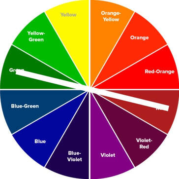 COMPLIMENTARY COLOURS Complimentary colours are found on the opposite side of the colour wheel, like Red and Green, Yellow and Violet or Orange and Blue for instance. These can be used to great effect in food photography, creating an energetic eye-catching scene.  See how the Complimentary colours of Red and Green really make this subject pop! 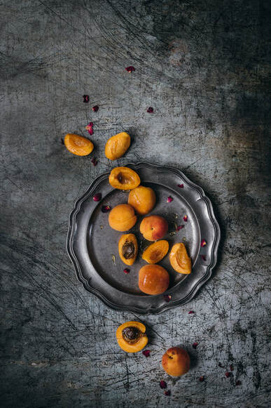 Finally, let's not forget MONOCHROMATIC colours. This is when various shades of the same colour are used. This can create a dramatic look, and is very effective.
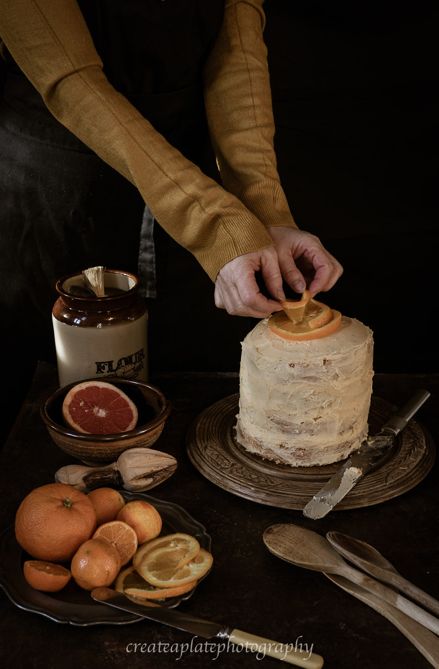
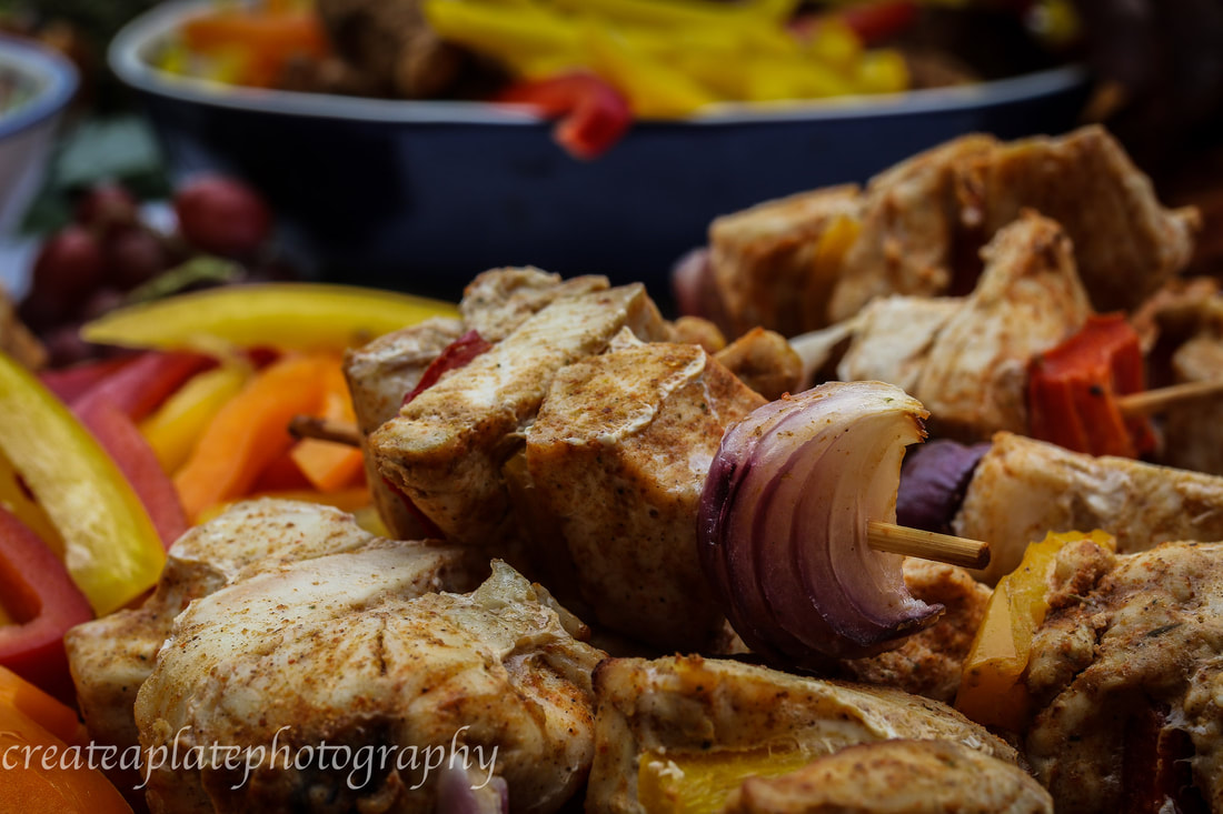
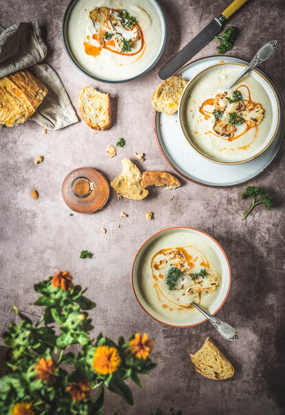
Here orange is the single colour, ranging from pale almost yellow to deep spashes of red/orange.
0 Comments
Leave a Reply. |
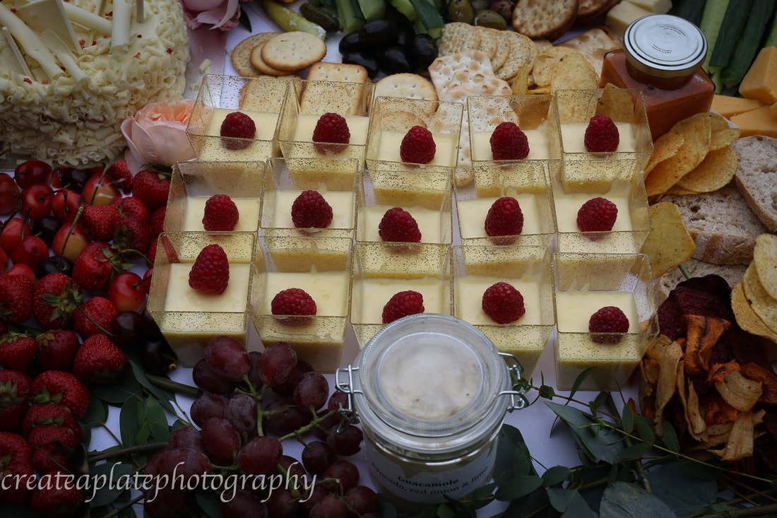
A Wedding Breakfast
|